

Showing posts with label illustration. Show all posts
Showing posts with label illustration. Show all posts
Monday, February 21, 2011


Tuesday, August 17, 2010
Yoga, yoga, yoga
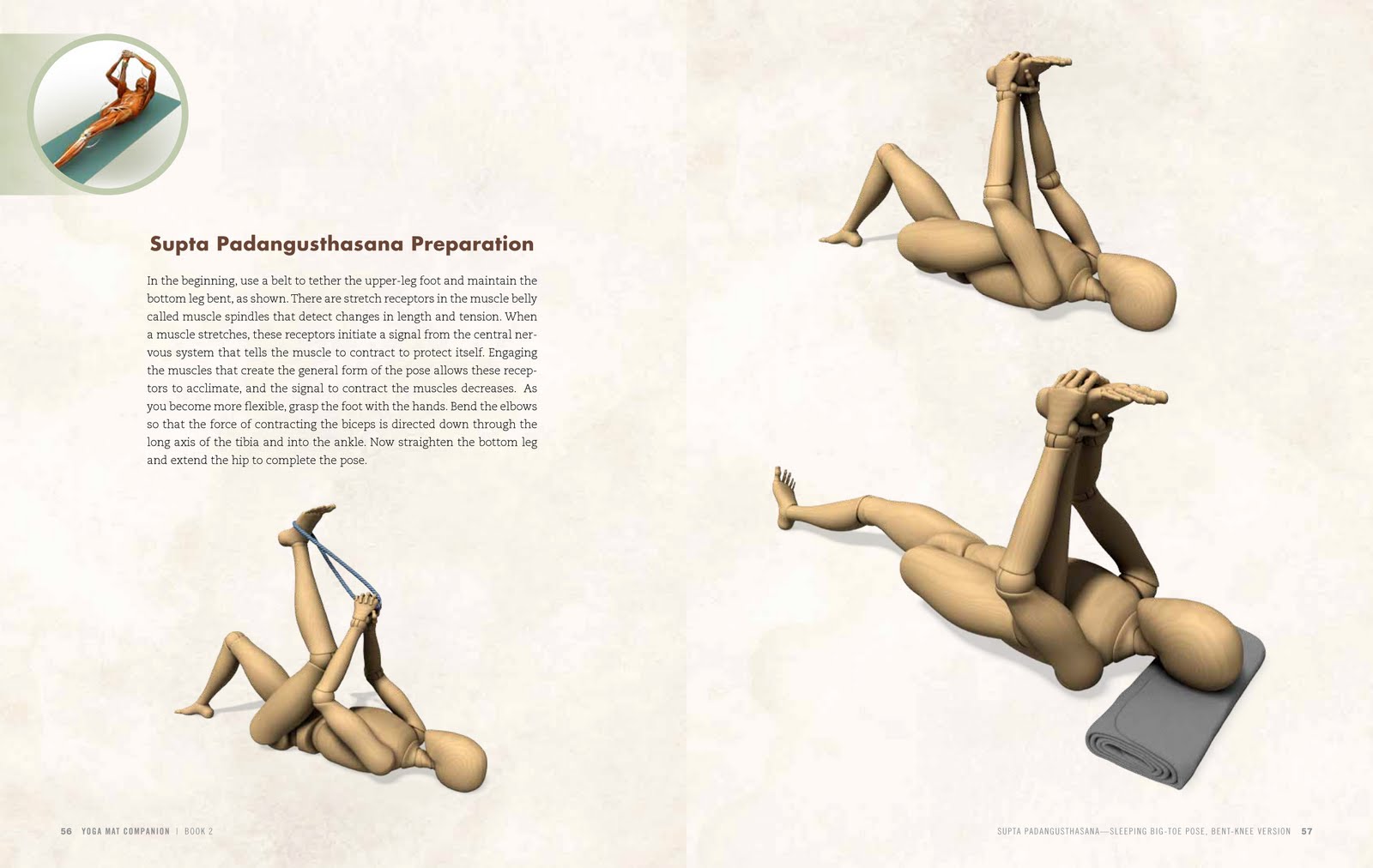
For the last few weeks I have been immersed in the layout of a series of 4 yoga books, artfully (I hope!) arranging gorgeous anatomy images with their captions. As I was completing an anatomy section which shows among other things the muscles, tendons, and bones of the hands; I was reminded of a recent NPR story about how human hands differ from other primates'. Check it out here: http://www.npr.org/templates/story/story.php?storyId=128676181
Below are a spread from the yoga book and an image from the NPR story. Do you ever find yourself geeking out over anatomy or other scientific topics?

Below are a spread from the yoga book and an image from the NPR story. Do you ever find yourself geeking out over anatomy or other scientific topics?

 |
| photo by Maggie Starbard/NPR |
Thursday, July 22, 2010
Good review just in!
Jeff Michaels, a client of ours and author of Please Hug Me, I've Been Delayed, got a solid review in this week's ForeWord Magazine. Congrats, Jeff!
"Filled with sarcastic tips and reassurances, this book consoles discouraged airline passengers when confronting various flying mishaps. From long security lines or discoveries of delays, to inquiries about when and where to buy cheap tickets or crippling fears of a crash landing, Michaels provides a range of advice. He also discusses the history of flight (again, sarcastically), as well as recent incidents where take-off and landing crises were averted by pilots and passengers alike. If Michael’s counsel doesn’t get readers through their flights, at least it will entertain them."
Below is his final cover with illustration by the fab C. Covert Darbyshire (see his witty New Yorker cartoons here) followed by a few of my favorite rejects:


Wednesday, July 21, 2010
Yoga from a new perspective
I've been spending most of my time lately laying out a series of four yoga books. Despite the minor and major annoyances associated with dealing with huge, huge image files while simultaneously adjusting to the new InDesign CS5, it's been great fun.
I just love the medical-style illustrations. They remind me of the Ciba Collection series of anatomy books my mother had that I loved so much as a kid. See one of them here. (Hmm, I wonder if my mom still has them...?)
Tell me this—if seeing someone else yawn makes you yawn, and seeing someone else having sex makes you frisky, does seeing someone else do yoga make you want to stretch?


Wednesday, May 26, 2010
Why do some images show up again and again?
We are awash in images. Think of all the paintings, photos, videos, and screen captures that are made every day. And yet... book jackets can still end up using the same image. Maybe this fact gives credence to the the idea that some images are just better than others——because they continue to resonate with people over time. (Or maybe we designers are just a bunch of lazy copycats!)
So with that in mind, take a look at this great collection of covers:
Even with the exact same image, it's interesting to see how much typography, cropping, and decorative elements can alter the focus of an image.


So with that in mind, take a look at this great collection of covers:
Even with the exact same image, it's interesting to see how much typography, cropping, and decorative elements can alter the focus of an image.


More copycat covers here:
Thursday, March 18, 2010
Choosing an illustrator
I was assigned a delightful project—a dating book about how girls can hook up with European guys. How fun! I immediately imagined something young, girly, flirty, and ooh, la la!
I went font shopping immediately. Buffet Script, Buttermilk, Mr Canfields, Narziss! I was in script heaven.

My excitement was soon tempered by my workload. We're busy with a lot of projects in all stages of production, so I was a little relieved to hear a week later that the author had decided to hire an illustrator for the cover. We have not had this happen before. It seemed like a good idea...
The author chose the illustrator, and this—in retrospect—is where the trouble began. Where I was visualizing feminine and flirty art with impressionistic brush strokes and bright colors...
... instead the author chose an (super talented) illustrator whose style is monochromatic, masculine, and highly photorealistic. It was at this point that I should have told her that this particular artist just would not work for her book's genre. Instead I tried to be diplomatic and critiqued the content of the artwork instead of the choice of illustrator. Big mistake.
Over the next few days the author and I went back and forth about whether to feature a woman (no), whether to have a 'European' element (yes), and whether to use a feminine type treatment (no). But the look-and-feel had been set, and no amount of 'corrective' suggestions on my part could alter that.
Long story short, I rang the alarm bell on the project too late—the artwork is almost complete and our catalog deadline is less than two weeks away. The whole situation blew up in my face—the author feels misled and trusts us even less than she did at the outset, and the book will probably have cover art that is too masculine and stiff for its genre. Sigh.
For future projects, as a company we've decided to add a clause in our contract to stipulate that we need to approve illustrators used for cover work. And personally, I now get that the choice of illustrator is a crucial decision that has unalterable consequences for the design. Live and learn.
The following comps were created just in case the author heeded our concerns and decided to give us a chance to develop something we felt was more genre appropriate in a rush. No such luck.


Subscribe to:
Posts (Atom)




